Manual rides and heaps more
25 February, 2015 by David JohnstoneIt’s been a while, but some new features have landed today.
Manual ride entry
First up, manual ride entry, which means you can create rides without having recorded them with a bike computer.

To create a ride, click on the day you want to create the ride for on the calendar, and then click “add manual ride” and fill in as much of the form as you want. These rides can be linked to a training plan. If a duration and training load or intensity is provided, intensity or training load (if not provided) and effective power is automatically calculated because they’re all mathematically related.
Ride summary editing
It is also now possible to edit the summary data of all rides. This can be done on the page found via the menu next to the date on ride pages:

Climbing algorithm improvement
The way climbing is calculated has been modified. There now must be a two metre elevation change before it is counted towards the total amount of climbing in a ride. This fixes a problem where small changes up and down accumulate and result in a much larger climbing figure than expected (this problem is related to the coastline paradox). Only some bike computers had issues related to this — the Garmin Edge 500 didn’t, but the Edge 510 did.
More athlete comparative statistics
The athlete statistics page now also shows how your riding in the last four weeks compare with everybody else.
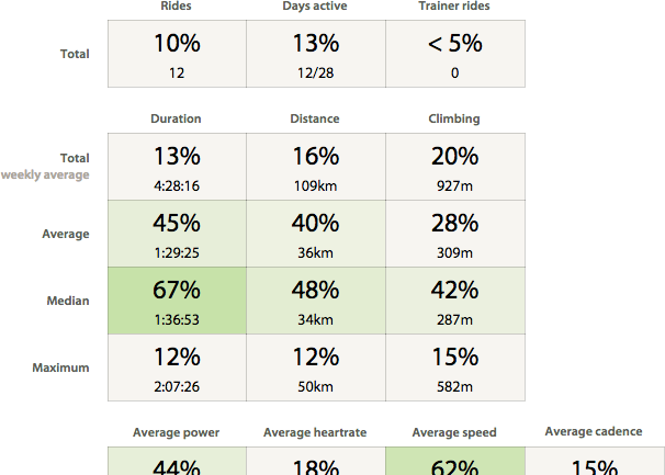
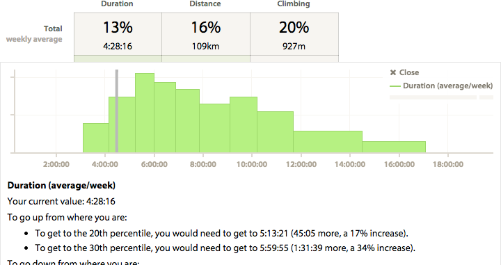
The percentage shown is your percentile rank, so a “62%” for total duration would means that you rode for longer than 62% of people in this time period. Higher values are shaded green, although bigger isn’t always better. Clicking on any of these boxes shows more information:
This data is based on all users who have at least one ride a week and a total of at least eight rides for the four week block. As with the power curve comparison chart on the statistics page, only data for the 5th, 10th, 20th, 30th, … , 80th, 90th and 95th percentile are stored. I’m not sure if this is of much practical use, but it seemed interesting to me.
Time/percentage toggling for ride summary zones
Clicking on the zones chart on ride pages now toggles between showing time and percentage in zones:
New power curve chart preview
Finally, there is a preview of the new power curve chart, which can be found via a link at the bottom of the current power curve chart page. It looks much like the old one, but clicking on “show more options” reveals a lot more. Here is what it can do:
- Additional power curves can be added.
- The date ranges of curves can be fully customised (i.e., six weeks, six months, or between any two dates).
- Watts/kg is handled properly.
- For each curve, either the best data is shown (the default behaviour), or the best n (where n is specified by you), or all data.
- Clicking on the chart “freezes” the information box, which means the links to the rides (which are for the best values for each curve) can be clicked on.
Here are all rides from all time:

Here are the top five rides from all time, and the top three rides from this year:

Most things in the legend can be clicked on. The week/month/year/etc. label can be clicked on to change what unit is used for the date range. The number to the left of that can be clicked on to change how many weeks/months/etc. the curve is for. The offset (to the right) refers to how many weeks/months/etc. the curve is from today. For example, for a curve for this year, the offset will be zero. If it’s last year, the offset will be one. This will be useful when the chart gains the ability to save the configuration, as the offsets (and not the actual date ranges) will be saved, so it will be possible to have the chart compare the last six weeks with the six weeks prior to that without having to continuously modify it. This chart is a lot more complicated than the current one (although it’s just as easy to use as the current one for everything the current one does), and it’s easy to make a very messy chart with these new options. I’m very open to feedback about this chart.
That’s all for now.
This is the blog of Cycling Analytics, which aims be the most insightful, most powerful and most user friendly tool for analysing ride data and managing training. You might be interested in creating an account, or following via Facebook or Twitter.