Improved comparative statistics
27 March, 2015 by David JohnstoneThe colourful chart that shows how your power curve compares with all other Cycling Analytics users has always had a problem with faulty power readings skewing the data high, especially for short time periods. This issue has now been fixed with the help of some smarter filtering algorithms.

Here’s what it looked like before today’s update. It turns out that 5% of Cycling Analytics users don’t have a maximum power output of over 2000W.

By the way, here’s what this chart looked like when it was first introduced. The bumpiness is because it’s made of real people’s data, and there wasn’t nearly as much of it on this site at the time.

The filtering isn’t perfect, but it’s about as good as me at looking at the (new) power curve and having it show all curves from all time and deciding which high ones, if any, are dodgy. It can be fooled if you’ve uploaded a bunch of gentle Sunday morning rides and a time trial or some sprint training, but it also requires a certain amount of data or it won’t look at the data at all. The biggest issue with the data on this chart now is probably that it’s skewed low because many people’s power curves don’t reflect what they are capable of.
Because the data is now more accurate, and because there’s a lot more data than there used to be, there is now a new top tier shown on the chart (in a pinkish sort of colour), which is the 95–98th percentile group. Previously, the top group shown was the 90–95th percentile group.
This chart still only shows data for males because there still aren’t enough females with power meters on this site to make a decent looking chart (it would look a lot bumpier than the “original” chart shown above).
To complement this chart there is now a new table underneath that shows how you compare.
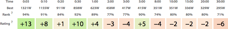
Rank indicates where your best effort for a time is ranked compared with everybody else. For rating, the average of your ranks is found and a curve is generated which represents a perfectly average user of your average rank. Then, your best effort is compared with what that average user of equal average rank can do, and the difference is shown as a percentage. It doesn’t matter if you didn’t follow that, you just need to know that higher numbers indicate that you’re stronger than expected for that time period given all your other best efforts, while negative numbers indicate that you’re weaker. (I’m pretty sure it’s impossible for all of the numbers to be positive, except for extreme circumstances like if you’re in the top 2% for all durations.)
This table clearly shows that some people are better at time-trialling (these are made-up numbers, but it’s based on real people):

Or sprinting:

There have been a bunch of other changes today, but they can go in another post.
This is the blog of Cycling Analytics, which aims be the most insightful, most powerful and most user friendly tool for analysing ride data and managing training. You might be interested in creating an account, or following via Facebook or Twitter.