Mobile support and lots more
13 February, 2026 by David JohnstoneHere’s a big update to Cycling Analytics. The biggest new thing is that Cycling Analytics should now work properly on mobile devices. To go with this, there’s a new rides page designed with mobile devices in mind. Also in this update is automatic uploading via the Wahoo API, a preview of the periodisation planner, a way to show activities that share a route, more filtering options for the power curve chart and rides table, the ability to add height and age, running metrics, Flexicharts enhancements, and a few more bits and pieces.
The general approach to creating a mobile solution has been to adapt the existing site to also work on small screens and touch devices with minimal apparent changes to the desktop interface. This site can be added to your phone or tablet’s home screen via the “add to home screen” item of the browser menu on Android or under “more” in the share menu in iOS. Charts now fully support touch events: pinch to zoom, two finger panning, and for the main ride chart, hold to initiate select/deselect. Some pages, like the rides calendar, can’t really be squashed onto a phone-sized screen, so a best effort was made to make them usable while retaining functionality. There are probably some rough edges.
To go with the rest of the mobile enhancements, a new interface to activities and upcoming plans designed with mobile devices in mind has been created. This is now the default rides page for small devices.
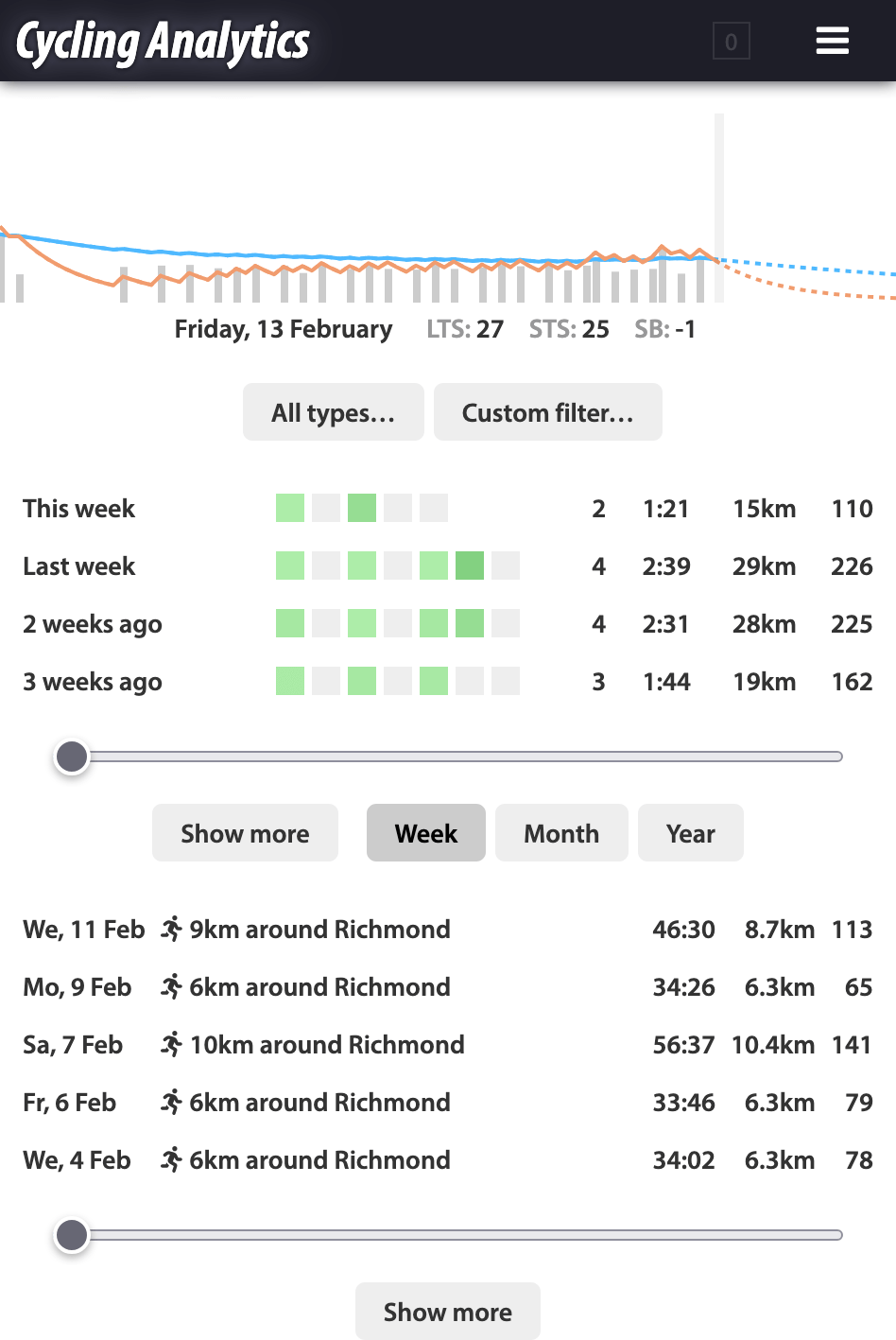
At the top there is a training load chart for the most recent period. Then there are controls to filter activities shown in the following sections. Then there is a summary section that shows some details about weeks, months or years. The coloured blocks represent the load for each day of the period and the numbers show the activity count, duration (in hours:minutes), distance and training load. Then there is a section that lists activities. By default it shows all activities, but tapping on a summary row causes it to show just the activities in that period. The sliders for summaries and activities scroll through them. The idea here is that it should be fairly easy to navigate to activities done at different times. Then there is a section that lists upcoming training plans. Tapping on an activity or training plan brings up a view of that item. The full page for the activity can be accessed from here.
The main ride chart has been remade from scratch (so that it too can work on touch devices because previously it was entirely separate to other charts, but now it’s built with the same framework as other charts so it gets things like touch functionality from that). For the most part, it is extremely similar to the old chart. It now extends across the entire width of the screen and on wider screens it leaves space on the right for the legend and chart controls (on small screens, drag the controls away or tap at the bottom to hide them if necessary).
The main new feature for the main ride chart is that it supports smoothing, which uses Gaussian kernel smoothing, so the number is the standard deviation of the kernel, meaning data within that many seconds or metres (depending on the x-axis mode) provides 68% of the influence on that point, and two standard deviations do 95% and so on.
The main ride chart has a couple of potential quirks with how it handles data. When smoothing, the info box will show the smoothed data numbers (except for the gear), but the selection will always show data based on the original data. Speed in selections is based on the distance data, which may not correspond exactly with the speed data, especially for very short selections. My impression is that some GPS devices have much more similar GPS and speed data than others (meaning they do less processing to get the speed data). Speed data directly calculated from GPS data and elevation can be added from the drop down menu at the bottom of the chart controls (be aware that the GPS data here is relatively low resolution so the speed calculated here will be accurate to about 0.4km/h).
Automatic activity imports from the Wahoo API are now supported. This can be set up on the linked accounts page.
There is now a preview of the periodisation planner, which will be for planning at a higher level, for a year or season. It is a preview for now because I am interested in hearing some feedback before committing to making it work roughly like this. For example, is this in the right direction? Is the logical flow of the tool in line with how you think about structuring training? For the moment, the link to the preview page is under the “ideas” link on the user drop down menu in the header.
Your height and age can now be added to your profile. This is on the user information page. These will be used for statistical things in the future. For example, age brackets in user statistics.
The power curve chart can now filter the activities shown on it, which is particularly useful for athletes who have power data in multiple types of sport.
Rides along the same route can now be shown at the bottom of the ride page. Some comparative summary statistics are shown after clicking the “show similar activities” button.
The rides table has two new functions for searching for activities based on GPS. near(lat, lng, [distance]) matches activities for which the route goes within the specified distance (defaulting to 1km) of the given point. One way to use this is to go into Google Maps and right click somewhere to get the point to copy and paste into this. like(ride_id) matches activities with routes that look like that of the specified activity, just like the find similar rides tool on the ride page. This can be used to find out exactly how many times you’ve done a certain route.
For running, vertical oscillation and ground contact time are now read from FIT files and reported. Stride length is also shown.
Stress balance is now shown for the previous day by default. This can be changed to the current day (which was the previous behaviour) on the training load page.
There are some new functions in Flexicharts. This command includes many of them:
chart().type('running').filter(r => r.summary.avg_heartrate > 145 && r.summary.avg_heartrate < 165).avg_speed().avg_heartrate('color').color_axis(120, 180).add_trendline(0.1).title('Speed of moderate HR runs').zoom_latest(1, 'y').legend('left');
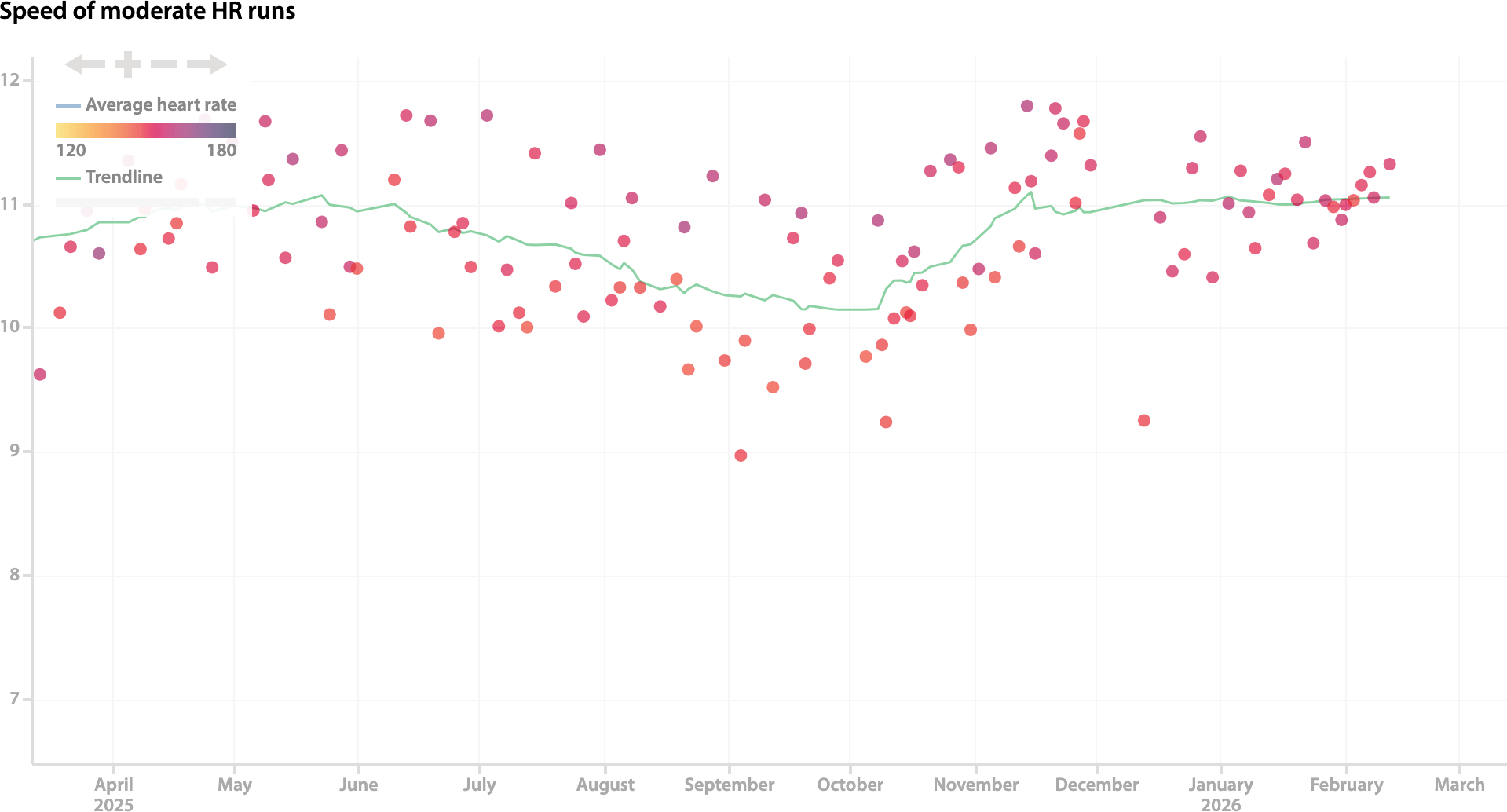
add_trendline removes the need to write a second command with trendline().on(-1) by showing a trendline in addition to the current data. title puts some text above the chart, which is particularly useful if you put multiple charts in one saved item. zoom_latest means you don’t have to zoom in if you always want to look at a recent range. legend can put that on the left, which is useful if you generally want to look at the right end of the chart. There’s also filter_y to provide a way to directly filter on the y value (there’s also filter_x and filter_color) and near(lat, lng, [distance]) and like(ride_id) that can be used in filter.
This is the blog of Cycling Analytics, which aims be the most insightful, most powerful and most user friendly tool for analysing ride data and managing training. You might be interested in creating an account, or following via Facebook or Twitter.