Flexicharts improvements and new Strava uploading
14 August, 2013 by David JohnstoneFlexicharts were introduced last month as a way to make custom charts. A number of improvements have been made to them, so it’s now possible to chart multiple things on one chart, and they now have access to power curve and PWC data. Therefore, it’s now possible to make charts like:

This chart shows the best 5 sec, 1 min, 5 min and 20 min power output for each ride (as points) and each month (as lines). This chart is created with these commands:
>>> rides.power_curve(5).points({color: 'hsla(190, 78%, 35%, 0.2)'})
>>> rides.power_curve(60).points({color: 'hsla(260, 78%, 35%, 0.2)'}).on(-1)
>>> rides.power_curve(300).points({color: 'hsla(330, 78%, 35%, 0.2)'}).on(-1)
>>> rides.power_curve(1200).points({color: 'hsla(40, 78%, 35%, 0.2)'}).on(-1)
>>> rides.power_curve(5).group_by(month).aggregate(max).line({color: 'hsla(190, 60%, 70%, 1)'}).on(-1)
>>> rides.power_curve(60).group_by(month).aggregate(max).line({color: 'hsla(260, 60%, 70%, 1)'}).on(-1)
>>> rides.power_curve(300).group_by(month).aggregate(max).line({color: 'hsla(330, 60%, 70%, 1)'}).on(-1)
>>> rides.power_curve(1200).group_by(month).aggregate(max).line({color: 'hsla(40, 60%, 70%, 1)'}).on(-1)
The new functions used here are power_curve(seconds), which shows the highest average power for a given duration in each ride, and on(-1), which shows the data on the previous chart instead of creating a new one. There’s also epower_curve(seconds) that uses the highest effective power instead of average power, which might be preferable for longer durations (15 minutes and up). The documentation has been updated accordingly.
Flexicharts can also show PWC150 and PWC170 values, which are the power values that are generated at a heart rate of 150BPM and 170BPM based on a statistical correlation between heart rate and power for each ride. Using this data, a chart like the following can be created, showing the PWC150 and PWC170 for each ride, plus the average of those values for each month:

A chart like this can be created with the following commands:
>>> rides.pwc170().points({color: 'hsla(30, 78%, 55%, 0.3)'})
>>> rides.pwc150().points({color: 'hsla(200, 78%, 55%, 0.3)'}).on(-1)
>>> rides.pwc170().group_by(month).aggregate(average).line({color: 'hsl(30, 70%, 70%)'}).on(-1)
>>> rides.pwc150().group_by(month).aggregate(average).line({color: 'hsl(200, 70%, 70%)'}).on(-1)
Finally, tables can now be created instead of charts by using table(), and the highest/lowest n items can be shown in tables with min(n) and max(n):
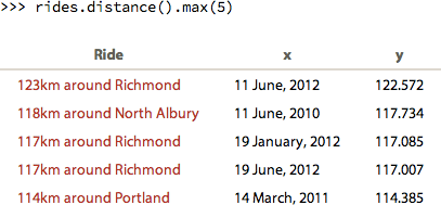
When the items in the table are rides, a link to the ride is provided. Therefore, these can be useful for looking back at your rides to find the longest, fastest, highest etc.
The next thing to do here is make it able to save charts so that you don’t need to reenter the same commands each time you go to the page if you want to see particular charts.
Cycling Analytics now has access to the Strava API, so rides can be automatically uploaded to Strava with that. This means that, if you want your rides automatically uploaded to Strava, you’ll need to connect your account to Strava again. (This should be the last time in a while that this needs to be done.)
The Strava status page doesn’t yet work quite as well as it used to, but hopefully it will soon (I’m waiting for some additions to Strava’s API). On the other hand, the “uploading to Strava” text at the top of each ride page now automatically updates itself to a link to the ride on Strava when it’s ready without requiring a page reload.
That’s all for now.
This is the blog of Cycling Analytics, which aims be the most insightful, most powerful and most user friendly tool for analysing ride data and managing training. You might be interested in creating an account, or following via Facebook or Twitter.