Improved Strava ride management, and a few more things
14 June, 2013 by David JohnstoneThere’s now a tool for managing the connection between rides here and on Strava. It can be accessed via the linked accounts page if you have set up your account to upload rides to Strava. (Here’s a direct link.) It tends to look something like this:

It’s useful for adding or removing connections between rides here and on Strava, and is handy if something has gone wrong when uploading a ride to Strava. There are more instructions at the bottom of the page.
On the topic of integration with Strava, there are a couple more changes coming soon: there will be an option to strip power and/or heart rate data from the ride that is sent to Strava; and there will be a way to only send select rides to Strava, rather than all of them (although, it’s possible to do this now by disabling automatic Strava uploading on the linked accounts page, and using the new Strava management page to upload only the rides you want).
In other news, the ride summary (at the top left of ride pages) has been updated. It’s been entirely remade, but the most notable changes are that either power or heart rate based metrics can be viewed (if both exist), power and heart rate zones are displayed… continue reading
Power zones
12 June, 2013 by David JohnstoneCycling Analytics now does power zones properly. Power zones can now be set as a percentage of FTP, and the actual wattages used are based on the FTP that is current for the ride. Power zones can be configured on the power management page (previously, this was the FTP management page), and power zones can now be shown on the zones chart:

Fullscreen charts
10 June, 2013 by David JohnstoneDo you ever lament the fact that your massive widescreen monitor is barely used by most websites (except by some that don’t enforce a maximum width and have text running across the entire width, which doesn’t do much for readability)? Well, now it’s possible to make charts go fullscreen.
To do this, find the little grey bar on the right at the bottom the chart legend, hover the mouse over it, and then click on the fullscreen option.

As an aside, the wider grey bar on the left has a use too — clicking on it hides (or shows) the legend, which is useful for some of the charts where the legend otherwise gets in the way of what the chart is showing.
There are a few charts that don’t support this at the moment (because they’re using older charting code). Eventually they’ll be replaced.
Comparative statistics
10 June, 2013 by David JohnstoneThis post might have a complicated sounding title, but most of this is pretty straight forward. One of the nice things about having a lot of data from a lot of people is that interesting things can be done with that data. Therefore, there are now a few simple charts that show Cycling Analytics users how they compare with the rest of the users. Head over to the statistics page and take a look.
The first few charts show how the user’s resting and maximum heart rates, weight and FTP compare with those of everybody else. They look something like:

This chart shows a histogram of all users’ resting and maximum heart rates, and the solid thinner lines show where this particular user (me!) lies. In the chart legend it says that 34% of users have a lower heart rate than me and 43% have a higher resting heart rate. This probably means that 23% have the same resting heart rate (that is, it’s in the same 50–54BPM grouping), except rounding errors mean these numbers don’t always add up to exactly 100%. If you hover over the chart with your mouse (on the actual page, not this picture), it shows what proportion of the users have a resting heart rate lower than where the mouse is… continue reading
Heart rate vs. power chart
8 June, 2013 by David JohnstonePower output and heart rate have a complicated relationship. When you ride hard, your heart rate goes up. When you get tired, you find it harder to produce the same amount of power, and when you’re tired enough, you find it hard to raise your heart rate. And, all else being equal, the fitter you are, the more power you can produce at the same heart rate. Looking at power and heart rate data together can reveal more than either alone.
There is a concept in exercise science called physical working capacity (PWC), which refers to the amount of power that is produced at a specific heart rate. PWC130, PWC150 and PWC170 are the the power produced when the heart rate is raised to 130BPM, 150BPM and 170BPM. Ideally, these numbers are worked out by doing a specific test, but it’s also possible to work some things out by looking at power and heart rate from a normal ride.
Cycling Analytics now has a new chart that shows how heart rate and power are related. It is found on the pages for all rides that have power and heart rate data, and it looks something like:

Your first impression might be “that’s a big, colourful, messy set of lines and dots”, but it does… continue reading
Heart rate and weight history
14 May, 2013 by David JohnstoneRather than having a single weight and a single resting and maximum heart rate, as of today, these numbers now have dates associated with them, so an entire history of them can be stored. They can be shown on a chart too:
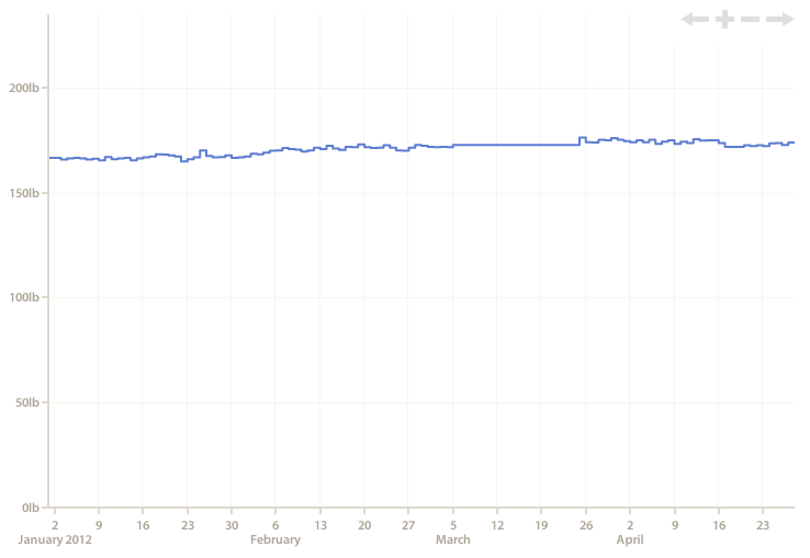
Charts appear on the FTP, heart rate and weight pages when there are more than five of the relevant value.
This is useful for people who measure their resting heart rate frequently (a higher than normal resting heart rate often occurs when overtraining), and also for those who want to keep track of their weight.
This also means that these three parameters (weight, resting and maximum heart rate) are now treated in conceptually the same way that FTP is — they’re histories of a value, and provided at least one value exists, the value for any day can be given according to the following rules:
- If the date is before any entries, the value of the first entry is given.
- The value of the most recent entry on or before the date is given. No interpolation is ever done, and this is why the chart above looks “stepped”.
Finally, this also means that FTP, weight, resting and maximum heart rate have a consistent interface on the API that is being developed. Let me know if you want early… continue reading
Privacy controls
24 April, 2013 by David JohnstoneUsers can now choose what aspects of their data they want visible to others on the privacy settings page. It looks something like this:

Hiding power and heart rate data prevent all data about power and heart rate from being revealed (including averages and maximums and the data stream for the ride). Hiding power and heart rate metrics prevents information that could be used to directly work out the FTP and heart rate zones used to be displayed (including intensity and training load).
Recent changes (and fixes)
18 January, 2013 by David JohnstoneHere is a short update about a few recent changes and other things.
Normalised work is now calculated as intensity2 × time riding, rather than as intensity × time riding. (This is how it was always meant to be calculated.) This has caused all normalised work values to be changed, and consequently all short-term stress and long-term stress values have also changed (I suppose it’s possible that some haven’t, but generally they will have changed).
Ride uploads were mostly broken for a day or so a couple of days ago (so if you tried to upload a ride earlier this week, but it didn’t work, try again now). Thankfully a number of people let me know, and I worked out that it was caused a minor change I made that had nothing to do with ride uploads, but caused some other things to be updated, which in turn caused most ride uploads to fail. Since then I’ve added some more monitoring so I am alerted when things go wrong (it lets me know when file uploads fail, and when “Something went horribly wrong” errors occur), so hopefully now I will learn of major problems very quickly, and find bugs that my testing hasn’t picked up.
One more thing: One of the things I’ve come to appreciate in running this site is that ride files can contain all sorts of things that you don’t expect. My favourite example so far is from a FIT file that a user of this site was having difficulty uploading. It turned out that halfway through, the timestamps jumped ahead exactly 4599 days, to July 2025.
Heart rate zones
13 November, 2012 by David JohnstoneCycling Analytics now supports heart rate zones.

This chart shows the time I spent in each heart rate zone for each week in the last six months. If this was the real chart you could hover over it with a mouse and see more information. You could also have rides grouped by month or by day instead of by week. And, you can hide zones, which makes it much easier if you just want to focus on one zone, .
If you want one of these for yourself, you first need to add heart rate zones. The easy way to do this is to go to the heart rate management page and click “Set zones automatically” and five heart rate zones will be generated automatically based on your maximum heart rate (so make sure that’s set first). However, there are lots of different approaches to making heart rate zones, so this is very flexible — you can tell it how many zones you would like, and then specify your preferred heart rate range for each zone (and you can even specify their names).

Support for US units of measurement
9 November, 2012 by David JohnstoneHere’s something for everybody who prefers to think in terms of miles, feet, pounds and Fahrenheit — Cycling Analytics can now display distances, elevations, speeds, weights and temperatures using the US customary units.
To get this, simply go to your profile settings page and tell it to display US units. Then, distances will be displayed in miles, elevation in feet, speed in miles per an hour, temperature in degrees Fahrenheit, and weight in pounds (even though the only place weight is used at this time is for displaying power in watts/kg, and that remains in watts/kg when using US units — I doubt many people think of a cyclist’s power to weight ratio in terms of horsepower and pounds).