A thirteen minute 1 in 20
29 October, 2012 by David JohnstoneHave you ever wondered what it takes to ride a thirteen minute 1 in 20?
In 2002, one of our Aussie pros, Trent Lowe, did just that, clocking 13:02 before going on to win a Junior World Mountain Bike XC Championship title. Now, with the help of a video of the ride, a bit of physics and a lot of guesswork, I’ve had a go at reconstructing the ride.
The short answer is: you need to be able to put out about 6.2W/kg, which is 395W if you weigh 64kg. And, if you can do that, you’re probably being paid to ride a bike.
For anybody who isn’t aware, the 1 in 20 is a very popular climb near Melbourne, named after its fairly constant gradient (although there’s a false flat in the middle). The current Strava KOM time is 13:20, which is based on about 16,000 ascents so far.
My approach to generating the data for this ride was to:
- Ride the 1 in 20 myself with a helmet camera and a GPS.
- Find places where both rides were in the same position, thus providing checkpoints for Trent’s ride (i.e., after 2:12, he had gone 1.142km).
- Use a physics model to work out what constant power output would be needed to get to the each checkpoint in the required time (speed data was generated here).
There a number of caveats worth mentioning:
- This heavily relies on the elevation and gradient data being accurate, but the data I have doesn’t appear to be as good as it could be. One issue is that the gradient is a lot spikier than it should be, which, in turn, causes the speed to be spikier than it should be. Compare the generated data with a real 1 in 20 ride.
- The model is assuming that there was no wind on the day.
- There’s no guarantee that the drag coefficient or frontal area (used to calculate wind resistance) is accurate.
- The system weight (bike+rider+clothes+everything else) is modelled at 73kg. That’s not necessarily true.
- I’m pretty sure the 15s drop to 215W starting at 7:40 wouldn’t match the real data.
All in all, take the data generated with a grain of salt, but I think that it would broadly… continue reading
Power and heart rate data on the training load chart, together
17 October, 2012 by David JohnstoneYou normally ride with a power meter. Occasionally you only ride with a heart rate monitor. You want all your rides to be represented on the training load chart. Does this describe you? If it does, you’re in luck, because Cycling Analytics can now show rides with power or heart rate on the one training load chart.
At the end of the last blog post I pointed out the correlation between the heart rate and power metrics calculated to indicate the stress of the ride. Now, if you have rides with both heart rate and power (to calculate the correlation), as well as rides with just heart rate (or else this isn’t needed), the TRIMP score (from heart rate) is scaled so that it corresponds with training load (from power). Thus, TRIMP is used to estimate the training load for a ride. Traditionally, one would have to estimate the training load for a ride (it was two hours at 75%, therefore it’s 150), but automatically using heart rate is a lot easier.
If you are curious as to how well this actually works for your rides, you can look at a chart that shows how TRIMP and training load of all of your rides correlate. This chart is found at the bottom of the training load chart (and you have to click on the button to make it show).
One other recent change with the training load chart is that starting values for short-term stress and long-term stress are calculated automatically if custom values aren’t provided. The guess works well if the first week or two of your rides uploaded are representative of the riding you were doing previously, but it won’t be so good if you had an unusually big first week. If you know that the guess is inaccurate, custom values can be used instead.
One more thing: mini-training load charts are shown on the main “rides” page in the monthly summaries. These show the same information that the training load page shows when it loads. That is, it defaults to showing the same data (power and HR together if it can, else just power, else just HR) and uses the same initial values.
Better heart rate monitor support
11 October, 2012 by David JohnstoneSince a lot of “serious cyclists” don’t have power meters, I have received a number of requests to do more with heart rate data. Therefore, Cycling Analytics is now calculating the TRIMP score for rides, which, in turn, can be used to generate the training load graph for users who don’t use a power meter.
TRMIP, or training impulse, is a metric based on heart rate that is designed to capture the stress of an activity in a single number. The formula used (described below) relies on the sex, resting heart rate and maximum heart rate, so users must enter these values before TRIMP scores are calculated.
Once TRIMP scores have been calculated, Cycling Analytics uses TRIMP scores to generate training load charts. Therefore, a user’s rides page will contain more enlightening monthly summaries, and the main training load chart page is useable.

This is similar to what a user with a power meter would see, except there is a big gap in the middle where the power curve is shown. Do you have any suggestions for what could fill that gap?

Better ride navigation (for old rides)
8 October, 2012 by David JohnstoneGoing back in time to look at old rides is now a whole lot easier. Rather than having to endlessly scroll down and repeatedly click “show more”, there’s now a list of years and months that can be used for navigation.

Immediately underneath “Rides” on the left there’s now a list of years and months where rides exist. Clicking on the year collapses or uncollapses its list of months, while clicking on a month takes you to those rides. The number of rides in each month is shown when the mouse is over the month name. And, to make life easier, the list of years and months is always visible, regardless of whether you’re looking at the top, bottom, or middle of the ride list.
If you want to see this in action, take a look at my rides.
Improved timezone handling
4 October, 2012 by David JohnstoneThe way timezones are handled has changed. Previously, dates and times were shown according to the timezone set in profile settings. Now, dates and times are shown according to the timezone that the ride starts in.
There were a few problems with the old approach, with the main one being that the date of a ride when it is shown may not be the same as the date that it was considered to have when the power profile was generated. Why? The best-for-the-month and best-for-the-year power profiles are calculated ahead of time, and since it doesn’t know what timezone to use (the user can change their timezone), it uses the UTC date, but it’s possible for this to be in the wrong month or even year. For example, if you went for a ride at 7AM on January 1, 2013 in Melbourne (and your timezone is set to Australia/Melbourne, which — including daylight savings — is 11 hours ahead of UTC), the UTC date will be used when adding it to power profiles, and that date is 8PM on December 31, 2012.
The new approach completely avoids this problem by always using the local date. There are a couple of potential problems. Firstly, the wrong timezone might be chosen. This shouldn’t happen, but get in contact if it does. Secondly, this doesn’t work when there is no GPS data for a ride. If this is the case, the user’s timezone (at the time the ride was uploaded) is used.
That’s all for now. Oh, for any software developers reading this, I’ll probably be releasing an open source latitude/longitude to timezone lookup library and a web API in the near future.
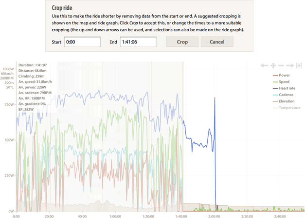
Ride cropping and data editing
26 September, 2012 by David JohnstoneSometimes the data you get from your bike computer isn’t quite right. Sometimes you’ll see massive power spikes, and — if you’re like me — occasionally you’ll forget to stop the device at the end of a ride or forget to reset it before the next ride. Therefore, you can now chop off the start or end of a ride, and also edit the raw data. The controls are located in the menu next to the date.

Ride cropping
Choosing Crop ride brings up something like the following, for a ride where I forgot to turn my bike computer off.
Trainer view, and lots of little things
25 September, 2012 by David JohnstoneWhen you’re riding on an indoor trainer, seeing a map of your ride probably isn’t very useful. Therefore, it isn’t shown any more.

It works by detecting that the rider hasn’t gone far, so it might be confused if you ride to your next door neighbour’s house or if you do Fat Cyclist’s 100 Miles of Nowhere around the end of a cul de sac (or if your GPS drifts far more than I’ve ever seen), but it seems to work fine in practice. You’ll notice that the titles of these rides are more appropriate for rides done on a trainer.
Since the last post, many other things have changed:
- It’s now possible to download individual rides in the format they were uploaded. This can be done by clicking on the cog icon next to the date of a ride and choosing download. (This is in addition to being able to download all the rides you’ve uploaded at once.)
- Rides can be edited. This is also under the cog icon. This is useful especially if your power meter generates an unreasonably large value and you want to correct it. A more complete explanation of this feature will appear when ride cropping is available.
- When making selections on the main ride… continue reading
More charts
6 August, 2012 by David JohnstoneThere are now two more charts on ride pages to go with the power curve.

The first of these shows the relationship between the force on the pedals and cadence (and I think it’s the prettiest chart on the site). Each dot represents one second’s worth of data. This chart is divided by the grey lines into four areas (or quadrants):
- The top right is high cadence and high force. Sprinting will put points into this area.
- The top left is low cadence and high force. Accelerating from stationary in a big gear will get points here.
- The bottom left is low cadence and low force. Recovery rides and soft-pedalling in a bunch will be largely in this area.
- The bottom right is high cadence and low force. A time-trial will generally fall into this area, as will spinning on rollers.
This chart is useful to visualise the neuromuscular demands of a ride. Here’s a more thorough article about the interpretation of this chart.
The grey lines are drawn so that the vertical line is at a cadence of 80 RPM (by convention) and the horizontal line is at the force required to generate FTP (functional threshold power) at 80 RPM. The yellow line indicates FTP (which is why this line and the grey lines all meet… continue reading
Monthly summaries in the ride list
24 July, 2012 by David JohnstoneThe ride list used to be just that — a list of rides. That seemed a little boring, so now there is a summary of each month’s riding interspersed amongst the rides.
There is quite a lot in this summary, and most of it is based on power data. Take a look at this in practice on my profile.
The bit on the left is fairly self explanatory, with the number of rides, the distance travelled, and the elevation climbed. You don’t need a power meter to get this, and this is all you’ll see if you don’t have one.
The middle part is focused on the best power outputs produced in the month. There is a little power curve showing the best power for the month (in orange) and year (yellow). Purple highlights indicate that the best power for this month for this part of the power curve are also the best for the year. Next to that are the best average powers produced in the month for a few select time periods (which happen to roughly correspond with important physiological concepts like neuromuscular power (five seconds), anaerobic capacity (one minute), VO2 max (five minutes) and lactate threshold (twenty minutes)).
On the right is a miniature version of the training load chart. The blue line… continue reading
The training load table is now a chart
25 June, 2012 by David JohnstoneThe training load page used to have a big table full of numbers. It’s now a lot prettier:

This chart shows what riding one has been doing over time in a way that can indicate one’s ability to perform. The following ideas are key to understanding this chart:
- Training load (TL) — a measure of the overall effort of a particular ride. Individual rides aren’t presently shown on this chart. Having a correctly set FTP is very important for this chart to be meaningful.
- Long-term stress (LTS) — the long term average training load. This is what the body is used to doing. Higher values typically correlate with higher potential performance.
- Short-term stress (STS) — the short term average training load. This is what the body is currently doing.
- Stress balance (SB) — the difference between LTS and STS (before the ride). This indicates freshness (for positive values) or fatigue (for negative values).
Therefore, in preparation for an important race, it is ideal to have a high LTS (after lots of training in the previous months), but a low STS (after tapering) and consequently, a positive SB. The exact numbers that work best in practice varies from athlete to athlete, so experimentation is required, but this chart makes it possible to quantify them.
For the mathematically inclined, the long-term stress and… continue reading