Running pace and power chart
30 March, 2026 by David JohnstoneHere’s a table that shows a list of paces ranging from very fast to rather slow, the equivalent speed, an estimate of the power required, and the corresponding time that running at that pace will achieve for 5km, 10km, half marathon (21.0975km) and marathon (42.195km) distances. A custom distance can also be specified.
The power estimate is based on the ACSM running equation applied to a flat course, which estimates oxygen consumption using an amount that increases linearly with speed plus a small fixed cost, and converted to watts assuming a metabolic efficiency of 21%. Metabolic efficiency varies from person to person, as does biomechanical efficiency (how efficiently you turn body movements into forward motion), so these power numbers are more of a suggestion than an absolute guide. Triathletes who have a bike power meter tend to find these numbers reasonable, although it should also be noted that running and cycling fitness don’t directly cross over, so it requires training in both sports to be able to perform the similarly in both. This model was designed for speeds higher than 8km/h or 5mph and it is expected that this will overestimate power for lower speeds.
(Despite its name, this site can be used for running too.)
Distance unit:
Weight (for power):
Pace increment:
Custom distance:
| Pace min/km | Speed km/h | Power W | Power W/kg | 5km | 10km | Half marathon | Marathon |
|---|
Mobile support and lots more
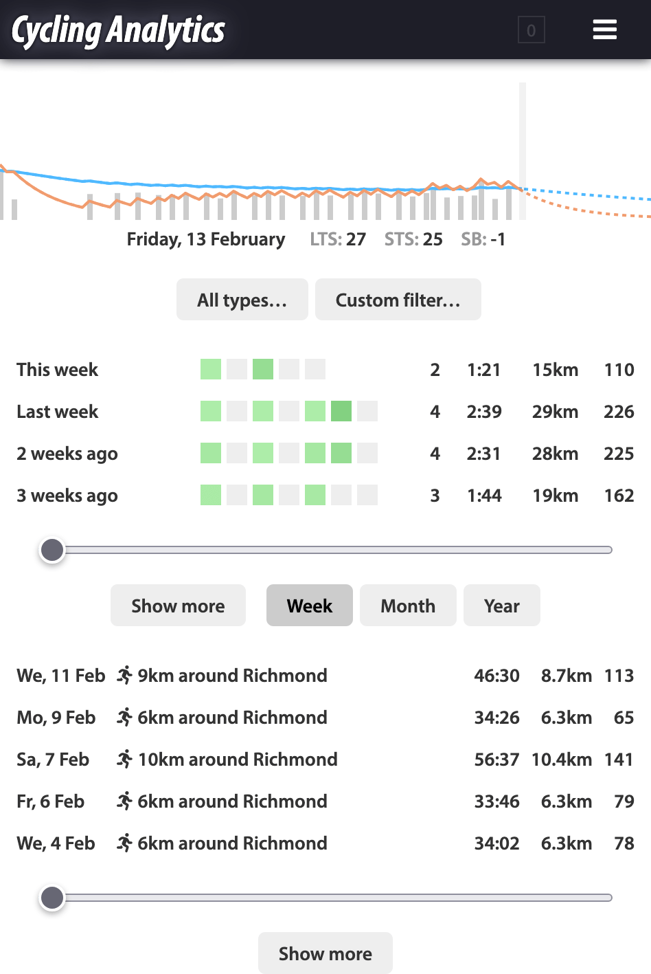
13 February, 2026 by David JohnstoneHere’s a big update to Cycling Analytics. The biggest new thing is that Cycling Analytics should now work properly on mobile devices. To go with this, there’s a new rides page designed with mobile devices in mind. Also in this update is automatic uploading via the Wahoo API, a preview of the periodisation planner, a way to show activities that share a route, more filtering options for the power curve chart and rides table, the ability to add height and age, running metrics, Flexicharts enhancements, and a few more bits and pieces.
The general approach to creating a mobile solution has been to adapt the existing site to also work on small screens and touch devices with minimal apparent changes to the desktop interface. This site can be added to your phone or tablet’s home screen via the “add to home screen” item of the browser menu on Android or under “more” in the share menu in iOS. Charts now fully support touch events: pinch to zoom, two finger panning, and for the main ride chart, hold to initiate select/deselect. Some pages, like the rides calendar, can’t really be squashed onto a phone-sized screen, so a best effort was made to make them usable while retaining functionality. There are probably some rough edges.
To go with the rest of the mobile enhancements, a new interface to activities and upcoming plans designed with mobile devices in mind has been created. This is now the default rides page for small devices.
Activity search/filter guide
13 February, 2026 by David JohnstoneThis is intended to be a complete guide for using text entry for custom queries for the places that allow that, such as the table view of your activities, the power curve chart and the mobile activities page.
The are two types of queries. Text queries simply look for activities that have titles, descriptions or activity types that contain the entered text. For example, richmond will find all the activities that have titles like “40km around Richmond”. Searching by activity type is less needed now that there is a drop down type filter, although the drop down filter always filters rather than giving the option of highlighting matched activities.
Logical queries are the second type of query, which evaluate based on activity summary data. For example, distance > 40 finds all activities with a distance greater than forty kilometers or miles, depending on your preferred units. The system automatically detects whether it’s a text or logical query. Here are the available variables and functions:
duration,total_time,moving_time— Times are in seconds, e.g.,duration > 7200is activities longer than two hoursdistance— Distance, speeds and climbing are in your preferred unitsclimbingworkepowerintensityvariabilityloadtrimppwc150,pwc170pwc_r2lrbalanceavg_cadence,avg_speed,avg_heartrate,avg_powermax_cadence,max_speed,max_heartrate,max_poweryear,month— 1–12,day— 1–31day_of_week— 1–7 for Monday to Sundaytime_of_day— 24 hour time as a decimal number, e.g.,time_of_day < 8.30is before 8:30am ortime_of_day > 18.00is after 6pmtype—'cycling','running','gym'etc., see the ride object below for more detailssubtype,purpose— See the ride object belowpower_curve(time),epower_curve(time)— Power curve and effective power curve, enter time in seconds, e.g.,power_curve(1200) > 300is rides with a 20 minute power above 300Wtext(string)— Matches when the string is contained in the title or description, case insensitive, e.g.,text('richmond')near(lat, lng, [distance])— Matches when the GPS path goes near the given point, see below for more detailslike(ride_id)— Matches when the GPS path is similar to the given activity, see belowhas— An object that can be used likehas.powerorhas.heartrate, see the ride object below for more detailsride— A ride object like this
near(lat, lng, [distance]) finds activities that go near a given point, e.g., near(-37.995, 145.037) or near(-37.8048, 145… continue reading
Recent updates
26 October, 2021 by David JohnstoneA couple of new features have been added to Cycling Analytics recently.
The power curve chart can now have filters applied, so it will only show rides that match the filter. For example, entering the filter ride.trainer will cause the chart to only show rides ridden on an indoor trainer. To use a filter, first click on the “Filter” button in the legend of the power curve chart (when a filter is used, clicking this button toggles whether the filter is applied). The help text contains more examples. The filter applies to the entire chart.
If you set activity titles on Strava, those titles can be imported and given to your activities on Cycling Analytics. To do this, use the “Copy ride titles from Strava” option on the linked accounts page.
There is now a tool to import rides from Zwift. It is a bookmarklet that, when created, allows you to upload the ride you’re looking at by simply clicking the bookmark button in your browser. (An earlier version of this tool previously existed, but stopped working when Zwift changed some things.)
Some bigger new features are basically complete or close to completion, so I’m hoping a larger update isn’t far away.
Upload rides from Zwift
26 October, 2021 by David JohnstoneHere’s a bookmarklet that uploads rides directly from Zwift to Cycling Analytics. When used on an activity page while the activity settings are shown, this immediately sends the ride to Cycling Analytics.
The first step is to create an authentication token so that the bookmarklet will have permission to upload rides. Go to the API console and enter the following and hit “enter”:
POST /tokens {permissions: 'create_rides'}
(This token will then be displayed on the apps page and can be deleted there. If you’ve previously created one, you can use that instead.)
Copy and paste the token here (just the part that looks something like EFS4Ef5wfDC8pmYbmpM3vITbjZY8wDWD) and click “create”:
Create a bookmark out of the link just created by right clicking and selecting the appropriate option or by dragging it to the bookmarks toolbar or library. Alternatively, create a new bookmark with the following value:
Enter the token and click “create” first.
Once the bookmark is created… continue reading
Activity types, W’ balance and other updates
3 December, 2020 by David JohnstoneCycling Analytics now supports activities other than cycling. Cycling Analytics remains focussed on cycling, but many cyclists do exercise other than cycling and it pays to keep track of that too. Cycling Analytics has always supported the data files, but now the activity type is indicated on the calendar and elsewhere.
![]()
Most of what’s new here is the ability to see and specify activity types. On the calendar, for example, activities that aren’t cycling have a little icon next to their name. The main change concerning how data is handled is that pace (minutes per kilometre or mile) instead of speed is shown by default for runs. Activities uploaded in the last couple of years or so should already have the correct activity type. Activity type can be changed on the activity page for individual activities or in bulk using the rides table view. The easiest way to fix older activities might be to go to the rides table and search for something like avg_speed < 15 to find activities that aren’t cycling. The rides table can now be searched by entering the activity type. For example, entering running or type == 'running' will show all runs.

Rating of Perceived Exertion (RPE)
3 December, 2020 by David JohnstoneRating of perceived exertion, or RPE, is a scientifically validated way of measuring the intensity of activity based on self-reported exertion. There are two widely used scales: 6–20 and 0–10. The 6–20 scale is designed to roughly correspond with heart rate with a resting heart rate of 60BPM and a maximum heart rate of 200BPM.
Cycling Analytics supports both the 6–20 and 0–10 scales. By default, the 6–20 scale is used. The option to change this is in the profile options. It’s best to stick with one scale, but it can be changed and existing RPEs will be displayed using the new scale. How RPEs are translated between scales is shown in the tables below. A 0–100 scale is also available as an option but isn’t recommended for normal use as it’s unecessarily detailed.
For regular users, it’s best to use one scale and never change it. The rest of the details on this page don’t matter.
For coaches, RPEs are shown to your athletes according to their preference. For example, if your account is set to use the 6–20 scale but their account uses the 0–10 scale, a plan you create with an RPE of 15 will display to them as 5.5. It would probably be best if your athletes use the same scale as you. You can see which scale and change it from athlete RPE page which can be found via the “view and adjust RPE settings” button on the coaching page.
For developers, RPEs for API endpoints are specified using a 0–100 scale. This is the same as the 0–10 scale multiplied by 10. A more complicated formula is used to convert to and from the 6–20 scale as the relationship between the numbers is non-linear due to the labels used on the numbers. Internally, RPEs are handled as numbers between 0 and 100 and are displayed to the user with the closest value of their chosen scale.
What follows are tables showing how the scales convert. The tables mean, for example, that 13 (somewhat hard) is equivalent to 42 on a 0–100 scale or 4 on a 1–10 scale.
When using the 6–20 scale:
| RPE | Label | 0–10 | 0–100 |
|---|---|---|---|
| 6 | No exertion | 0 | 0 |
| 7 | Extremely light | 1 |
Power model and other new things
20 January, 2020 by David JohnstoneCycling Analytics just received a major update.
The biggest new feature is the power model analysis tool. This looks at your power data and estimates how strong you are using the critical power model. This includes an FTP estimate.

Precisely what this shows is a bit complicated. The most important part is the numbers shown underneath. If you’re not interested in any theory, then note that this estimates your FTP, and there’s something underneath that predicts what power you should be able to sustain for any duration longer than a minute or two.
If you are interested in some theory, then according to the critical power model, you can sustain a certain power output indefinitely (critical power, CP) and you also have a certain amount of additional energy that can be used above the critical power (W’). As an equation, the maximum power that can be sustained for a duration is CP + W’ / time. For example, using the numbers in the screenshot, the maximum power that could be sustained for ten minutes is 280 + 17111 / 600 = 309W. There’s something underneath this chart on the power model page so you don’t need to do any maths yourself.
The orange line is the maximum power curve for the selected period, but shown as energy (joules) rather than average… continue reading
Recent updates
29 October, 2018 by David JohnstoneThere have been a few noteworthy updates to this site recently.
The histograms chart has been rewritten to be better and more flexible. Most notably, the bucket width can now be modified.

A number of changes have been made to training plans. Intensity, distance and climbing can now be specified for workouts, and when any two of duration, training load and intensity are specified, the other is calculated automatically. If all three are entered, the one entered least recently is changed.

Upload rides from Zwift
16 October, 2018 by David JohnstoneNote: This is an old version of this bookmarklet. Here is a later version.
Here’s a bookmarklet that makes it possible to upload rides directly from Zwift to Cycling Analytics. When run, a button is added to the Zwift interface to upload rides.
The first step is to create an authentication token so that the bookmarklet will have permission to upload rides. Go to the API console and enter the following and hit “enter”:
POST /tokens {permissions: 'create_rides'}
(This token will then be displayed on the apps page and can be deleted there.)
Copy and paste the token here (just the part that looks something like EFS4Ef5wfDC8pmYbmpM3vITbjZY8wDWD) and click “create”: